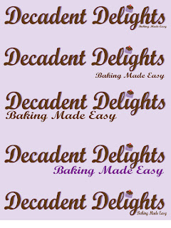
Here are some images that I scanned to use on my baking cover magazine.
Thursday, March 24, 2011
Cupcake Ai file
This is my cupcake file that I created in Ilustrator. I am replacing the dot of the I with it. I really liked how it turned out!
subtitle Exploration
Here are some of the typeface options that I was experimenting with for the magazine. I want to keep exploring though because I have to see it with the rest of the font on the cover. This font also has to coordinate with the pictures as well.
Masthead Exploration
Here is the first set of fonts that I worked with. I really liked this font, but I just wanted to see how another font would look so I tried Bermuda.
The Bermuda typeface was really fun and creative, but I didn't feel like it was a good typeface for my masthead.
I then decided to add my Ai file to my Masthead to see what they looked like together and I really liked how it looked. My favorite combination of the colors & text was the dark brown one, with the purple behind it.
The next step to deciding my mast head was to add the catch phrase of "Baking Made Easy."
This was my favorite Masthead combination out of the five options, but I will continue to critique it and improve on the text.
terrible sketch
This is a very terrible sketch that we were assigned to do with the walcom tablet. This is my first time using one, so my sketch turned out looking like a first grader drew it, but this will hopefully be the layout of my project.
Baking Magazine Mood Board
This is my baking mood board. I have different fonts that I could use for my magazine as well as inspirational pictures of baking items which serve as a good base for my magazine. I also have a color palette that I will use for my magazine. I really had fun doing this particular project! :)
Magazine Mind Maps
The first mind map I created started with the word magazine and I was deciding what kind of magazine I wanted to focus on. The idea that stood out to me was Baking, so I decided to make a baking magazine.
Tuesday, March 15, 2011
Photoshop Magazine Project
Original Magazine Picture ( Taken on Photobooth so the image is backwards.)
Pic I took of myself to fit into the magazine picture
Pic I took of myself to fit into the magazine picture
Finished Picture ( Again first image is backwards.)
For this particular project we had to take images from a magazine, scan them into the computer, take pictures of ourselves and use Photoshop to put ourselves in the picture using various tools.
google Sketch UP house..
This assignment was to explore Google Sketch Up. We had to take pictures of our house and make it in SketchUp. Here are my pictures compared to screen shots.
Subscribe to:
Comments (Atom)


