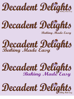
Here is the first set of fonts that I worked with. I really liked this font, but I just wanted to see how another font would look so I tried Bermuda.
The Bermuda typeface was really fun and creative, but I didn't feel like it was a good typeface for my masthead.
I then decided to add my Ai file to my Masthead to see what they looked like together and I really liked how it looked. My favorite combination of the colors & text was the dark brown one, with the purple behind it.
The next step to deciding my mast head was to add the catch phrase of "Baking Made Easy."
This was my favorite Masthead combination out of the five options, but I will continue to critique it and improve on the text.


No comments:
Post a Comment